Blog
An Insight Into the Power of Colour: By Pantone
I was lucky enough to recently attend an insightful webinar on colour, held by Pantone.
It spoke about:
- The emotional response to colour
- How people view colour
- As well as what colour can mean to an individual, or as a business tool.
As I listened to the presentation, I couldn’t help but feel humbled to be part of an industry that has such a strong connection to colour. In every arrangement we make, the colours used portray a specific message, feeling or emotion. I think it also helps to define us as designers; through the individual colour combinations we use, and the colour choices we make. This also displays how much colour means to us as people.
I was also very intrigued by how differently we all see the same colour. They showed an image of a cherry – and then showed twenty images of the different colours people saw when they viewed the cherry. This made me wonder what others see in the colour combinations I put together, as well as what I see, when viewing my own (or others’) work. They even spoke about how different animals see different spectrums of colours – including ultra violet light.
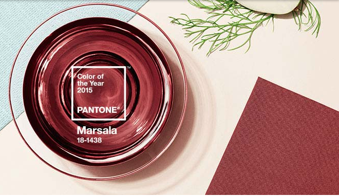
If you have the chance you should visit the Pantone website. While you’re there, check out the Pantone Colour of the Year, browse their site, and immerse yourself in the beauty and mood evoking emotion of colour.
Happy arranging!
Image Credit: pantone.com
Do you want to learn floristry? The Bloom College Flower School Flower Basics Course is the perfect introduction to floristry for those without prior experience caring for and arranging flowers. It is also well suited to those wanting to refresh the skills they gained from some prior experience. We have new Courses STARTING SOON. To find out more head to: http://bit.ly/1Nes64L