Blog
Design elements every florist needs to know

The elements of design are incorporated into everything, whether natural or man-made. These elements help to evoke emotional responses. When designers use the elements and principles of design to create a specific order, they evoke a particular emotional reaction, wherein you can literally feel what you see. These elements are colour, line, texture, space, shape and form.
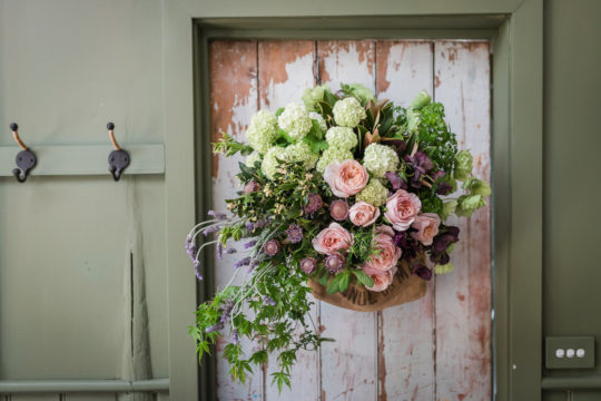
Colour
Colour refers to the visual response of the eye. It has the most substantial emotional power of all the elements. Combining colours and creating harmony between them can be one of the most pleasurable parts of floristry. However, colour is subjective. Many colour schemes have been made to help the designer maintain order and to control the emotions of the viewer.
A complementary colour scheme involves colours that are opposite each other on the colour wheel, making a bold statement that evokes excitement. Monochromatic colour schemes use a singular colour. Triadic schemes employ three colours distributed evenly on the colour wheel, such as red, yellow and blue. These colour schemes each evoke very different emotional responses.
Over the past twenty years, the floristry industry has witnessed a strong movement towards a less fixed use of colour, allowing florists the welcome freedom to express themselves with their choice of colour to influence the feelings of their customers.
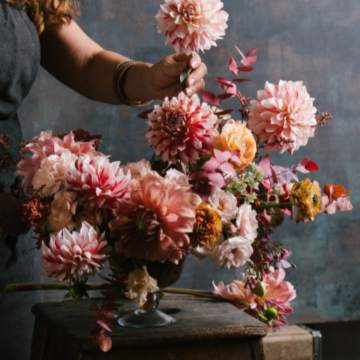
Line
Line is the direction in which a viewer’s eye travels when they look at a design. It gives a sense of movement around, through, and out of a design.
The florist may want the viewer’s eye to be drawn in and around the design, or, they may wish to draw the viewer’s eye in and then lead away to a focal point.
For example, flowers on a stage may not be the final resting point for the viewer’s eye but can be designed in a way that draws their eye to another area on the stage (generally the centre).
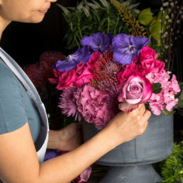
Texture
Texture relates to the surface qualities of an object. Texture can be either visual or tactile; some objects can visually appear to have one texture and actually have another one to the touch.
Like colour, texture evokes strong emotional responses. Small children are drawn to touch certain textures, while adults are more often drawn to look at textures––although some adults still cannot help but touch!
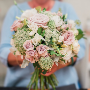
Space
Space is divided into two parts––positive and negative.
Designers need to consider the positive space in the room or area the design will sit in and create the arrangement accordingly. A small arrangement, for example, has little impact in a large hall or meeting room.
Positive space within an arrangement is the space occupied by individual flowers. It is important to occupy space within the design to enable the principles of scale and rhythm to be incorporated into the design.
Negative space is the empty space in a design around individual flowers and plant material, i.e. it is space without contents. Utilising negative space is a beautiful way to create focal areas, which are areas of dominance.
Shape & Form
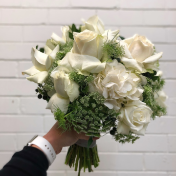
Shape and form are considered in every aspect of your design, from the overall look to individual flowers to the container they sit in.
Shape is a two-dimensional design element, such as a round sketch of a posy.
Form is a three-dimensional design element, such as the dome or ball of an actual posy.
Prefer a more in depth, practical knowledge of these elements? We go through the elements and principles of design in detail in our Bloom in Business Online Course. Access your free 30 min Bloom in Business session here, where Bloom College founder, Yvette Timmins will give you a snapshot into the full breadth of our business course and how you can become your own boss.