Blog
Floristry Basics: Colour Theory
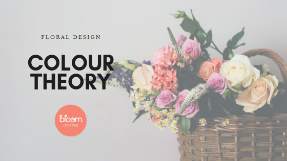
In our previous post about colour we talked about how colour has the strongest emotional power of all of the elements (did the vivid colours in above photo really grab you?), and how combining colours and creating harmony with them can be one of the most pleasurable parts of floristry.
In this post we delve a bit further into Colour Theory.
Colour theory is best understood with the aid of a colour wheel. This tool is a great visual aid that describes how colours relate to each other, and how to interpret these relationships. The ‘12 Colour’ colour wheel is the one that’s most often used in floristry and other design industries.

As you can see, half of the wheel is made up of ‘warm’ colours, while the other half are referred to as ‘cool’ colours. Black, white, and grey are considered neutral colours, and are not included on the Colour Wheel. Their role within the Colour Wheel is to be mixed with other colours on the wheel to create tints, shades, and tones. A colour becomes a tint when white is added to it. When black is added to a colour, a shade of the original colour is created. Meanwhile, when grey is added to a colour, it becomes a tone.

You may remember this next part from school:
Primary Colours
Red, yellow and blue. These colours are known as the Primary Colours and are base colours. They cannot be created through the mixing of other colours.
Secondary Colours
Secondary colours are the colours created when any two of the Primary Colours are mixed together.
For example:
Red + Yellow = Orange
Yellow + Blue = Green
Blue + Red = Purple
Now we move onto the more complex colours.
Contrasting/Complementary Colours
These sit directly opposite each other on the colour wheel. Examples of these colours include the violet and yellow colours within an Iris, or the Christmas colours red and green
Monochromatic Colours
Monochromatic colours are a single colour, and are modified using tints, shades, and tones of the original colour.
Triadic Colours
These are defined as colours evenly separated and spaced around the colour wheel. They produce good contrast and harmony with each other. To lessen the overall colour intensity, one colour can be used to dominate the design, while the other two complement its strength.
Analogous Colours
Analogous colours are next to each other on the colour wheel. They create a flowing natural look to a design. You can create a warm or a cool colour palate, depending on the side of the wheel from which you select your colours.
Split Complementary Colours
These are created when selecting one complementary colour, with the two colours lying either side of the opposing complementary colour. For example, red and green are complementary, so you might choose red, and then use the two colours which sit each side of green, these being blue-green and yellow-green.
Hopefully this insight into Colour Theory has given you a greater understanding of how combining colours and creating harmony with them is an enjoyable part of your floristry career (and why we cover it in our Floristry Career Change Course in even further detail). By gaining an understanding early on about Colour Theory, you can put your skills into practice, and have fun experimenting with colour.
Are you looking for a change of career?
Our Floristry Career Change Course is available as a full time or part time course. Places are strictly limited. For further information, and to apply, please email enquiries@bloomcollege.com.au