Blog
How to use colour theory in floristry
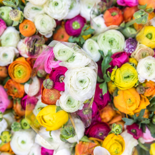
Colour theory is critical and relevant to many design industries. It is best understood with the aid of a colour wheel. The colour wheel visually describes how colours relate to each other and how to interpret these relationships.
The 12-colour colour wheel is most often used in floristry and other design industries. Half of the wheel is made up of warm colours, while the other half is referred to as cool colours. It is essential to understand that black, white and grey are considered neutral colours. Their role within the colour wheel is to be mixed with other colours on the wheel to create tints, shades, and tones. Colour becomes a tint when white is added. When black is added to a colour, it creates a shade of the original colour, and when grey is added to a colour, it becomes a tone.
Primary colours are base colours. These colours cannot be created through the mixing of other colours.
Secondary colours are base colours. These colours can be created through the mixing of other primary colours.
Contrasting/complementary colours sit directly opposite each other on the colour wheel. For example, the violet and yellow colours within an iris, or the red and green used at Christmas.

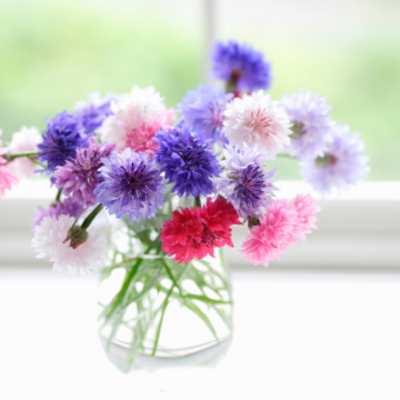
Monochromatic colours are a single colour, modified using tints, shades, and tones of the original colour.
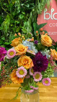
Triadic colours are colours that are evenly separated and spaced around the colour wheel. They produce contrast and harmony with each other. To lessen the overall colour intensity, one colour can be used to dominate the design, while the other two complement its strength.
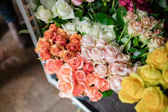
Analogous colours sit next to each other on the colour wheel. They create a flowing, natural look to a design. You can create a warm or a cool colour palate, depending on the side of the wheel from which you select your colours.
Split complementary colours are created when selecting one complementary colour, with the two colours lying on either side of the opposing complementary colour. For example, red and green are complementary, so you might choose red, and then use the two colours which sit on each side of green, these being blue-green and yellow-green.
Interested in learning more? We go through colour theory and the elements and principles of design in detail in our Bloom in Business Online Course. Access your free 30 min Bloom in Business session here, where Bloom College founder, Yvette Timmins will give you a snapshot into the full breadth of our business course and how you can become your own boss.