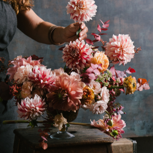
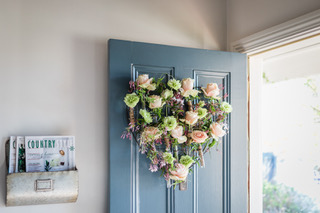
The design principles are the essence of creative design. They are the laws of relationship, providing designers with an organised system or plan for combining the elements of design into a finished product.
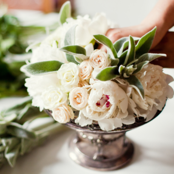
Balance
Balance refers to a design’s visual and actual weight distribution. Visual balance is achieved by the correct use of the elements of design. Actual balance is achieved by physically distributing the materials so the arrangement or object will not fall over. A top-heavy arrangement in a thin, small or lightweight vase will fall over, as it is not balanced. Overall design balance is present when both the visual and physical aspects of balance are successfully achieved.
Scale
Scale is necessary to create rhythm and harmony. It refers to the comparison between the sizes of two or more things, and the progression of steps or degrees. Designers incorporate scale to ensure contrasting elements are pleasing to the eye.
For example, scale can link the softest texture to the hardest texture in an arrangement by the designer incorporating varying degrees of textures in between. This principle relates to all elements––scaling from light colours to dark colours, big shapes to small shapes, unified lines to organic lines and so on.
Rhythm
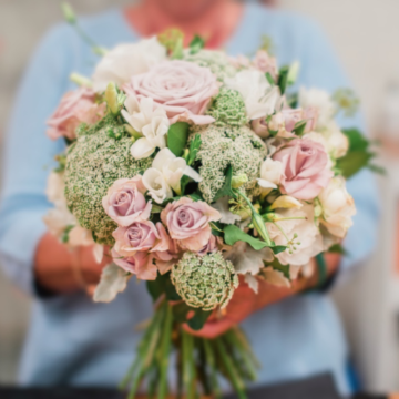
Rhythm and flow are critical parts of all design, as they lead the viewer’s eye seamlessly throughout the display or arrangement. Rhythm is the same as other principles, in that it is created by the use of all the elements. Line and colour, in particular, are wonderful for creating a rhythmic flow.
Dominance
Dominance refers to the part/s of the design being accentuated and the impact obtained by using some/all of the elements––colour, form, line, shape, and texture––to create a focal area. A focal area within a design is an area to which the viewer’s eye will be drawn. For example, when King Protea is used as the focal point in a design, we are creating dominance by using three elements: colour, size, and shape. It is important to note there can be more than one focal area within one design.
Proportion
Proportion refers to the relationship between the parts of the design, based on their relative sizes. For example, the relationship of an arrangement to both its container and the overall composition of its setting. Three points can be used to determine if a design is well-proportioned:
- There should be a visual balance between the arrangement and its container
- The arrangement or design object should be in proportion to the setting or chosen location of the design
- The visual weight of the flowers and plant material should be evenly proportioned using scale
Contrast
Contrast refers to striking differences, such as black and white (or Yin and Yang). It is achieved through the use of opposing lines, colours, shapes, and textures in both the design and its surroundings. Contrast is necessary to add visual interest for the viewer.
This is achieved in many ways, such as creating a design with soft and hard textures, the colours red and green, or by using any colours opposite to one another on the colour wheel. You could also pair a large round shape with a small round shape, round with a square, or thick strong lines and fine whimsical lines––the possibilities are endless. Then you can apply the principle of scale to bring it all together.
Harmony
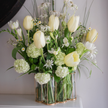
Harmony is the final design principle. A designer achieves harmony by successfully incorporating all of the other design elements and principles to create a unified, cohesive and visually appealing design.
Need more practical knowledge of these principles? We go through the elements and principles of design in detail in our Bloom in Business Online Course. Access your free 30 min Bloom in Business session here, where Bloom College founder, Yvette Timmins will give you a snapshot into the full breadth of our business course and how you can become your own boss.
