Blog
The Elements & Principles of Design

Are you a Floristry Student trying to learn the elements and principles of design and how they specifically relate to floristry? We have you covered all in this one blog so pour yourself a cuppa and read on…………
Design Elements
The elements of design are incorporated into everything, whether natural or man-made. These elements help to evoke emotional responses. When designers use the elements and principles of design to create a specific order, they evoke a particular emotional reaction, wherein you can literally feel what you see. These elements are colour, line, texture, space, shape and form.
Colour
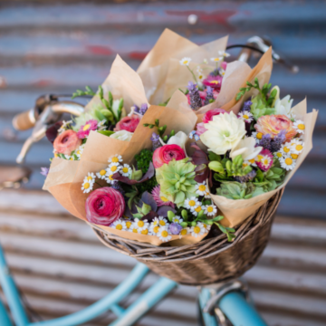
Colour refers to the visual response of the eye. It has the most substantial emotional power of all the elements. Combining colours and creating harmony between them can be one of the most pleasurable parts of floristry. However, colour is subjective. Many colour schemes have been made to help the designer maintain order and to control the emotions of the viewer.
A complementary colour scheme involves colours that are opposite each other on the colour wheel, making a bold statement that evokes excitement. Monochromatic colour schemes use a singular colour. Triadic schemes employ three colours distributed evenly on the colour wheel, such as red, yellow and blue. These colour schemes each evoke very different emotional responses.
Over the past twenty years, the floristry industry has witnessed a strong movement towards a less fixed use of colour, allowing florists the welcome freedom to express themselves with their choice of colour to influence the feelings of their customers.
Line
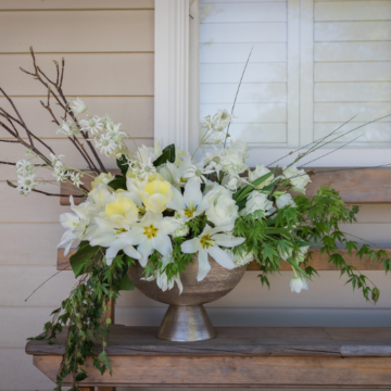
Line is the direction in which a viewer’s eye travels when they look at a design. It gives a sense of movement around, through, and out of a design.
The florist may want the viewer’s eye to be drawn in and around the design, or, they may wish to draw the viewer’s eye in and then lead away to a focal point.
For example, flowers on a stage may not be the final resting point for the viewer’s eye but can be designed in a way that draws their eye to another area on the stage (generally the centre).
Texture
Texture relates to the surface qualities of an object. Texture can be either visual or tactile; some objects can visually appear to have one texture and actually have another one to the touch.
Like colour, texture evokes strong emotional responses. Small children are drawn to touch certain textures, while adults are more often drawn to look at textures––although some adults still cannot help but touch!
Space
Space is divided into two parts––positive and negative.
Designers need to consider the positive space in the room or area the design will sit in and create the arrangement accordingly. A small arrangement, for example, has little impact in a large hall or meeting room.
Positive space within an arrangement is the space occupied by individual flowers. It is important to occupy space within the design to enable the principles of scale and rhythm to be incorporated into the design.
Negative space is the empty space in a design around individual flowers and plant material, i.e. it is space without contents. Utilising negative space is a beautiful way to create focal areas, which are areas of dominance.
Shape & Form
Shape and form are considered in every aspect of your design, from the overall look to individual flowers to the container they sit in.
Shape is a two-dimensional design element, such as a round sketch of a posy.
Form is a three-dimensional design element, such as the dome or ball of an actual posy.
Design Principles
The design principles are the essence of creative design. They are the laws of relationship, providing designers with an organised system or plan for combining the elements of design into a finished product.
Balance
Balance refers to a design’s visual and actual weight distribution. Visual balance is achieved by the correct use of the elements of design. Actual balance is achieved by physically distributing the materials so the arrangement or object will not fall over. A top-heavy arrangement in a thin, small or lightweight vase will fall over, as it is not balanced. Overall design balance is present when both the visual and physical aspects of balance are successfully achieved.
Scale
Scale is necessary to create rhythm and harmony. It refers to the comparison between the sizes of two or more things, and the progression of steps or degrees. Designers incorporate scale to ensure contrasting elements are pleasing to the eye.
For example, scale can link the softest texture to the hardest texture in an arrangement by the designer incorporating varying degrees of textures in between. This principle relates to all elements––scaling from light colours to dark colours, big shapes to small shapes, unified lines to organic lines and so on.
Rhythm
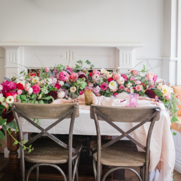
Rhythm and flow are critical parts of all design, as they lead the viewer’s eye seamlessly throughout the display or arrangement. Rhythm is the same as other principles, in that it is created by the use of all the elements. Line and colour, in particular, are wonderful for creating a rhythmic flow.
Dominance
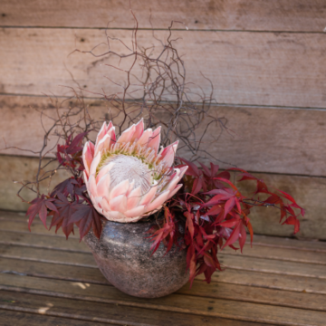
Dominance refers to the part/s of the design being accentuated and the impact obtained by using some/all of the elements––colour, form, line, shape, and texture––to create a focal area. A focal area within a design is an area to which the viewer’s eye will be drawn. For example, when King Protea is used as the focal point in a design, we are creating dominance by using three elements: colour, size, and shape. It is important to note there can be more than one focal area within one design.
Proportion
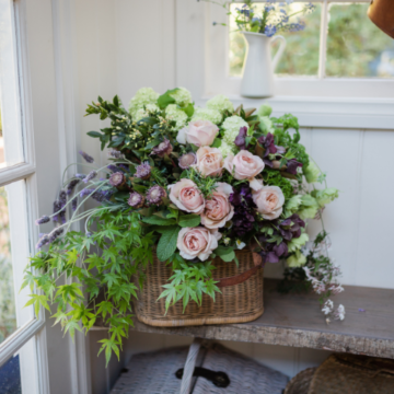
Proportion refers to the relationship between the parts of the design, based on their relative sizes. For example, the relationship of an arrangement to both its container and the overall composition of its setting. Three points can be used to determine if a design is well-proportioned:
- There should be a visual balance between the arrangement and its container
- The arrangement or design object should be in proportion to the setting or chosen location of the design
- The visual weight of the flowers and plant material should be evenly proportioned using scale
Contrast
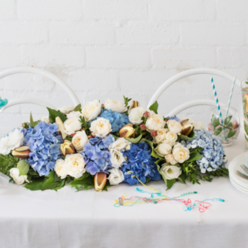
Contrast refers to striking differences, such as black and white (or Yin and Yang). It is achieved through the use of opposing lines, colours, shapes, and textures in both the design and its surroundings. Contrast is necessary to add visual interest for the viewer.
This is achieved in many ways, such as creating a design with soft and hard textures, the colours red and green, or by using any colours opposite to one another on the colour wheel. You could also pair a large round shape with a small round shape, round with a square, or thick strong lines and fine whimsical lines––the possibilities are endless. Then you can apply the principle of scale to bring it all together.
Harmony
Harmony is the final design principle. A designer achieves harmony by successfully incorporating all of the other design elements and principles to create a unified, cohesive and visually appealing design.
For more floristry skills and knowledge you might like to visit MyBlooms ebooks they are packed with helpful knowledge for aspiring florists
