Following on from our post last week, we look further into OHS in the Floristry industry.
Last week we listed some examples of possible risks and threats when working with flowers. This time, we’ll give a real life scenario for each of these, outlining the issue itself and the action that needs to be taken to rectify it.
SCENARIOS:
Electricity
Issue: Heaters and extension cords are haphazardly spread over the workroom floor. This is not only a tripping hazard, but with water from buckets and watering cans in the vicinity, it could also cause electrocution or shorts.
Action: Wet areas and electronics must be separated. Extension leads need to be taken off floors, and power points should be in areas where items such as glue guns, heaters etc. can be safely plugged in, away from wet areas, and close to the source. This way cables are not laying on the ground causing possible injury or death.
Lifting, bending, twisting
Issue: Where the tap is to fill the buckets is 10 metres from where the cool room and botanicals storage area is. Lifting, carrying, and bending is required to place buckets into the storage areas – and that it’s a long distance from where the water source is. This can cause unnecessary strain on muscles, cause back complaints as well as possible water spills.
Action: Purchase a wheeled trolley that the buckets can be placed on, filled with water, then put the botanicals on, and wheeled to the storage area.
Ergonomics
Issue: Workbenches are not set for a standing working height. This causes the back, neck and other muscles unnecessary strain.
Action: Benches need to be replaced with standing height benches. There also needs to be training sessions on personal working ergonomics. This may include training on how to hold yourself when making posies and bouquets to reduce strain, (including repetitive strain injuries).
Slips, trips & falls
Issue: Flowers being removed from display vases in the shop space and taken to the workroom. Water being spilt on the floor from the stems, causing a slipping hazard.
Action: Florists need to bring out a container to place the botanicals in from the display vases, to minimize water spilling/dripping onto the floor. Also, everyone needs to recognize this as an issue, and have a mop handy to wipe the floor dry immediately.
Tools
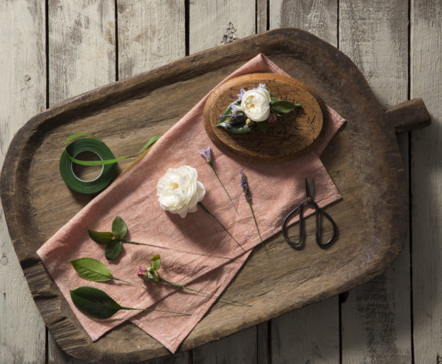
Issue: Incorrect use of tools, resulting in an increased risk of cuts and injuries. To avoid this, staff need to have training on how to correctly use tools.
Action: Staff training is conducted, showing how to correctly use tools, and should cut away from themselves to ensure cuts are avoided. All staff need to stay vigilant with themselves, and others, around this cutting technique.
Skin Conditions
Issue: Red itching skin on hands and arms. The florist gets a rash on their hands and/or arms from having a reaction to botanicals, or other items used.
Action: Florist to seek medical advice to ease rash. Use a process of elimination to determine which botanical material causes the reaction. Depending on the severity, the florist may choose not to handle that variety again or may choose to wear gloves.
This list above is by no means comprehensive, but it gives you an insight into how crucial OHS is in the floristry industry, or even if you are working with flowers as a hobby. There will usually be an OHS representative in every workplace, as well as procedures on what needs to be done in the case of an event occurring, so please check for specific details in your workplace.
Once you know and consider the risks, then you can ensure you always keep yourself and others safe. You can also ensure that all measures are taken to prevent any incidents happening to yourself or others. Vigilance to safety should always be monitored and reassessed to maintain a safe workplace.
Do you want to learn floristry? The Bloom College Flower School Flower Basics Course is the perfect introduction to floristry for those without prior experience caring for and arranging flowers. It is also well suited to those wanting to refresh the skills they gained from some prior experience. We have new Courses STARTING SOON. To find out more head to: http://bit.ly/1Nes64L
